Super Mario World 2: Yoshi's Island/Version Differences
This is a sub-page of Super Mario World 2: Yoshi's Island.
| To do: Note the changes made to Yoshi's icon between versions: https://twitter.com/vervalkon/status/1068404158762504192?s=19 |
A number of changes were made to the international versions, mostly graphical in nature.
Contents
Title Screen
| Japan | USA | Europe |
|---|---|---|
|
|

|
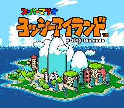
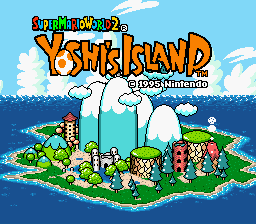
In Japan, the title is simply Super Mario: Yoshi Island. The international versions were instead marketed as a sequel to Super Mario World, carrying off of an idea seen in the ys_romX_0 and ys_rom_0_D prototypes where the game was subtitled Super Mario Bros. 5. The European version removed the ®.
Map Icons
| Japan | |
|---|---|
| International |
The Japanese icons for extra stages have a red and orange background, while the international versions added a star. In addition, the "Extra" stages are called スペシャル, "Special" stages in the Japanese version.
| Japan | |
|---|---|
| International |
The international versions have generic icons for the bonus stages. The Japanese version has enough room to fit the bonus game names in the icons.
| Japan | US | Europe |
|---|---|---|
The US and European versions have a completely different SCORE icon. Note that the US version changed the color of the buttons to purple. Since the controls menu in the US version wasn't changed, this was a bit pointless.
| Japan | International |
|---|---|
The squished balloon was redrawn a bit here. Yoshi's hands also seem to have been rounded out.
| Japan | International |
|---|---|
A slight alteration to the fins of the Cheep-Cheep in the stage icon for World 4-6.
Control Options
| Japan | International |
|---|---|
 |
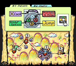 |
The letters on the buttons were bolded in the international versions. Oddly enough, the US version didn't update the colors of the buttons despite the updated control icon.
Score Screens
| Japan | International |
|---|---|
 |
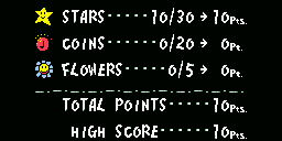 |
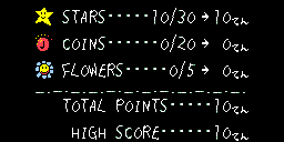
The font on the pause and total score screens was made thicker in the international versions.
Tutorial Graphics
| Japan | International |
|---|---|
 |
 |
The sound effect "pon" is removed from the tutorial graphics of Yoshi making eggs. This is about equivalent to the sound effect "poof" in English. It's also the sound Yoshi makes when laying eggs in later games.
| Japan | International |
|---|---|
 |
 |
More sound graphics removal. "Bun" is a swishing sound.
Mini-Game Graphics
Yet another sound effect graphic removed. In the Balloon Popping mini-game, this graphic appears when the incorrect balloon is popped. This is "suka", a sound effect used to represent a miss, like the sound of a bat whiffing.
| Japan | International |
|---|---|
 |
 |
The Japanese version has 当, the Kanji for Win/Hit, surrounded by a circle of stars when the correct balloon is popped. This was changed to a giant star for the international releases.
World 6-Extra
| Japan |  |
|---|---|
| International | 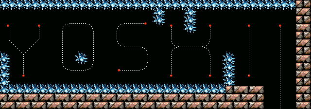 |
An alternate romanization for Yoshi's Japanese name is "Yossy", as shown here. In the international versions of the game, this section of World 6-Extra was changed to reflect the common spelling. The layout changes make this section of the level more difficult. This difference also exists in Super Mario Advance 3.
Revisional Differences
Score Screens
| Japan 1.0 | Japan 1.1 |
|---|---|
 |
 |
The nouns were pluralized, the string of dots were altered with the one by "Coins" changing from 5 to 6, and the one by "Points" changing from 6 to 5.
Font
| US 1.0 | US 1.1/Europe |
|---|---|
 |
 |
The font for the European version, as well as US revision 1.1, was made thicker, though graphics such as Controller buttons were left the same. The thicker font was later used in all versions of Super Mario Advance 3.